Branding »
Lighthouse Chiropractic
When a 16 year old Ed Osgood severely dislocated his shoulder, he visited his local chiropractor for assistance after nothing else seemed to work. The stunning results he saw created a newfound interest in the field and years of schooling later, Dr. Ed came back and purchased the practice that had started his love of chiropractic care. Absorbing the Lighthouse Chiropractic name, he wanted to keep the name recognition the brand had locally, but also modernize and reinvent it to fit more in line with his unique style of treatment.
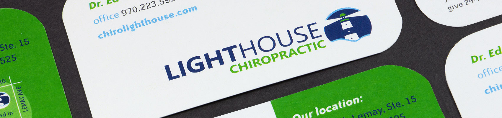
Lighthouse wanted Clay Pot Creative to develop something visually striking that would stand out against a crowded market of chiropractic providers. Utilizing blues and greens to exude the professional and caring nature of the practice, the new color scheme blended perfectly with the much more overt Lighthouse depiction.
The Lighthouse Chiropractic rebrand has since led to a new website design, business cards, direct mail campaigns and more, all showcasing the new look and feel of Fort Collins' best chiropractic center.