Branding »
Fruit Basket Orchard Logo Rebranding
The former owners of Fruit Basket Orchards had long used a generic piece of Clipart as their logo. Once the company was sold, the new owners wanted a makeover. Wanting something trendier, clean and modern to attract a younger audience, the team reached out to Clay Pot Creative for a refresh on their brand.
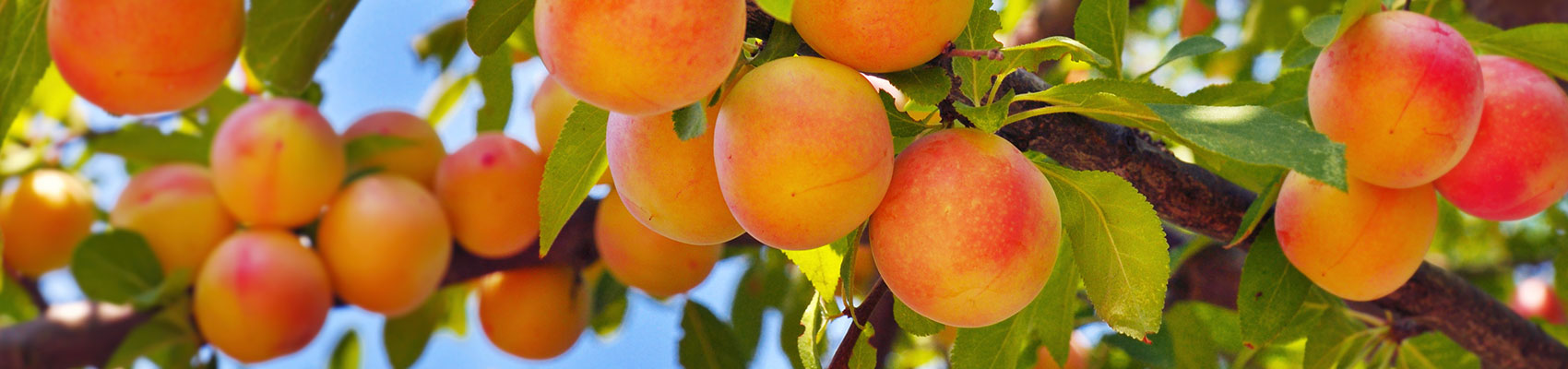
Growing everything from apples and apricots to peaches and plums, we wanted to give customers an instant snapshot on what they could get from Grand Junction's full-service U-pick orchard. Contrasting Earthy browns and greens with vibrant fruit colors, the updated logo accomplished exactly what the family owned and operated farm store was looking for.
The fun and youthful look purposefully reinforced the family friendly approach of the orchard where kids are encouraged to pick, eat, and repeat and that's exactly what families have done since the unveiling.